The redesign
We supercharged our original 2D designs by adding dimensionality. The skeuomorphic design reflects Google's brand refresh: the age of AI is dimensional, premium, and accessible. Designers drew and sculpted every shape in the new set by hand, and AI was consulted to help aid in improving visual accessibility.
AI as a collaborator and accessibility auditor
I built an AI tool that checks edge contrast. It flags pixel areas around the edge that fail color contrast and suggests fixes. Our designers collaborated with the AI tool and built the final font using its guidance as a starting point.
My role
I helped write the design guidelines. The core principle: quality and character of the 2D set while adding dimension and physicality. I helped write accessibility guidelines and make accessibility tooling to ensure that emoji are legible on both light and dark surfaces.
We also checked the set against the other vendors during every part of the design process and nudged the visual style to get a bit closer to Apple and Samsung, while still keeping our charm.
| Google (before) | Google (after) | Apple | Samsung | |
|---|---|---|---|---|
| Red Heart |  |  |  |  |
| Loudly Crying Face |  |  | 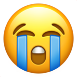 |  |
| Distorted Face |  |  |  |  |
| Party Popper |  |  |  |  |
Interoperability
It's important for emoji to render the same way cross platform. We redrew where ours fell short.
| Google (before) | Google (after) | Apple | Samsung | |
|---|---|---|---|---|
| Face in Clouds |  |  |  |  |
| Wheel |  | 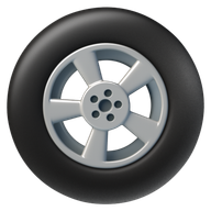 | 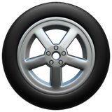 |  |
| Thought Balloon |  |  |  |  |
| Jellyfish |  |  |  |  |
| Ice Cream |  |  |  |  |
| Tropical Fish | 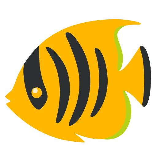 | 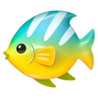 |  |  |
Visual accessibility
At message size, pale subjects on white lose their edges. We redrew these with defined edges at the same visual weight.
| Google (before) | Google (after) | Apple | Samsung | |
|---|---|---|---|---|
| Tornado |  |  |  |  |
| Cloud |  |  |  |  |
| Tooth |  |  | 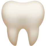 |  |
| Dashing Away |  |  |  |  |
Dark mode presents dark subjects on dark backgrounds. These hold their edges on both surfaces.
| Google (before) | Google (after) | Apple | Samsung | |
|---|---|---|---|---|
| Black Cat | 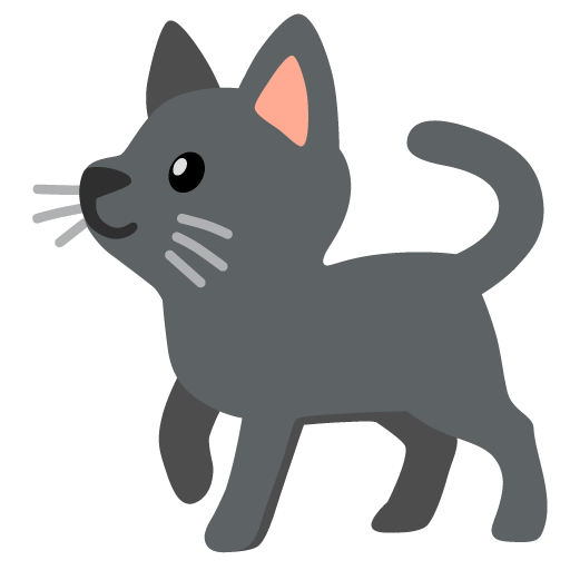 |  | 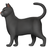 |  |
| Bear |  | 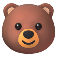 | 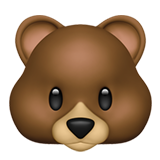 | 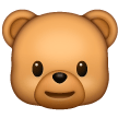 |
| Black Bird | 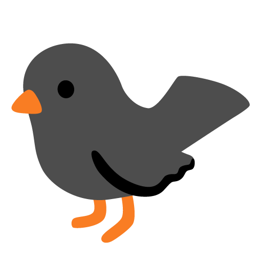 | 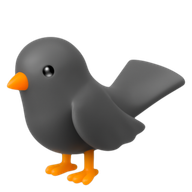 | 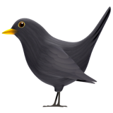 | 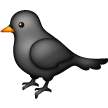 |
| Black Heart |  |  |  |  |

Working with stakeholders
I worked with research, design, marketing, and our collaborating firm.
I worked with design leadership (Jennifer Daniel) early on to write the color contrast guidelines and set art direction. I worked with our researcher (Alexander Robertson) to keep design decisions and tool work aligned with our research. I built assets with marketing for the blog posts and the other surfaces that carried the launch. And I worked with Huge from the start on internal tools that sped up color contrast auditing, mockup creation, emoji comparison, and slide deck generation.